Top Tips for Effective Data Visualisation with Tableau and Power BI
17 Jul 2023

As someone deeply immersed in the world of data, we are seeing an increasing demand for the ability to turn raw information into compelling narratives. Today, let’s explore the best practices of data visualisation, aiming to enhance clarity, consistency, and effectiveness in presenting your data.
Whether you are using Tableau or Power BI, mastering these techniques will elevate your data storytelling and empower you to convey insights with impact.
1. Understanding the Purpose for Targeted Audience Insights
Before diving into the intricacies of building a data visualisation, recognising its purpose is fundamental. Who are we communicating with? What specific knowledge are they seeking, and how do they prefer to digest data? These questions lay the groundwork for visuals that not only please the eye but also serve a meaningful purpose for the intended audience.
For instance, with business leaders you may want to tailor visuals to provide key insights at a glance. This approach enhances your understanding of the audience, enabling you to select the most effective chart or visual to convey your message.
2. Consistency as Key for Effective Data Visualisation
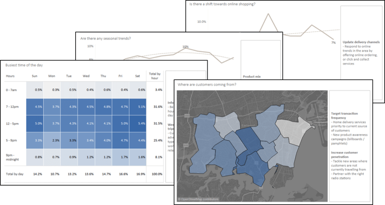
Consistency is key to effective data visualisation. Whether it’s the colour scheme, business definitions, or the overall design, maintaining uniformity across charts and dashboards is imperative. Adopting a template or design guidelines ensures users seamlessly transition from one dashboard to another, reducing the learning curve.
Standardised business definitions and calculations are also crucial to avoid confusion and misinterpretation of trends. Leverage common glossaries or FAQs for clarity.
3. Efficient Data Model Design for Optimised Visualisation
Efficient data design sets the foundation and also blueprint for successful data visualisation within your organisation. Design your data models with optimisation in mind, allowing it to serve multiple dashboards. This avoids creating a new dataset for each dashboard, simplifying lineage tracking and facilitating changes without a cascade of modifications.
Challenge the misconception that more data always equals better insights. Strategic aggregation in data modelling crafts a concise narrative without sacrificing depth – finding the sweet spot between comprehensive and efficient representation.
4. Engage End-Users: The Iterative Approach for User-Friendly Dashboards
Engaging end-users throughout development is not just a final step; it’s an iterative journey. Ensure you gather feedback regularly to ensure that dashboards evolve based on real user input, resulting in a user-friendly and impactful end product that aligns closely with expectations and real-world usage. We don’t want our end users to be surprised at the end of the dashboard build.
Consider establishing feedback loops, user testing sessions, and training programs to empower end-users in utilising data visualisation tools effectively.
5. Prioritise Insights over Reports: Top-Down Approach for Actionable Metrics
Initiate the visualisation journey with a top-down approach. Identify key metrics for users to track – easily understood indicators of “going well” or not. This is usually aligned with business goals or KPIs.
Highlight trends, anomalies, and patterns that lead to quick and actionable insights. Remember, the goal is not just to present information but to empower users to make informed decisions. Leverage automation to highlight critical insights. Automated alerts notify users of sudden shifts that require immediate attention, ensuring that decision-makers focus on what matters most.
6. Ensure Data Security: Best Practices for Privacy and Control
Data privacy and data security should not be an afterthought but rather integrated as a cornerstone of any data visualisation strategy, which is key for maintaining trust and safeguarding sensitive information.
Best practice is that common data models should be void of any personal or sensitive information, or, at the very least, only hashed or encrypted data is used to ensure de-identification.
Where personal information is required, implement robust security measures, such as securing data in a separate environment, access controls or row-level security, to ensure only authorised individuals can access this information. Establishing a clear governance or approval process is essential for users seeking access to personal data, ensuring responsible and controlled utilisation of such information.
7. Continuous Learning and Improvement: Stay Updated on Trends and Techniques
Data visualisation is a dynamic field. Encourage continuous learning and improvement within your team. Stay on top of emerging trends, tools, and techniques. Foster a culture that values curiosity and innovation in the pursuit of better, more impactful visualisations.
Here are some suggestions to keep your skills sharp:
Attending data visualisation meetups in your local area (check meetup.com)
Enrol in courses offered by universities and institutions such as Coursera or LinkedIn Learning
Access material from technology providers such as Tableau or Power BI Webinars and Conferences
Conclusion: Transforming Data into Impactful Narratives
In conclusion, data visualisation is both an art and a science. By embracing these best practices, you transform data into effective visual “masterpieces” that inform and guide decision-making. It’s not just about what you see but how you see it, and with the right practices, you can turn your data into a narrative that shapes the future of your organisation.
Frequently Asked Questions (FAQs)
About EdgeRed
EdgeRed is an Australian boutique consultancy specialising in data and analytics. We draw value and insights through data science and artificial intelligence to help companies make faster and smarter decisions.
Subscribe to our newsletter to receive our latest data analysis and reports directly to your inbox.

